Onboarding is the conversation a product has with someone who has not yet decided to trust it. Get it wrong and you have lost the user before they ever get to use the thing. The onboarding I inherited was wrong in most of the ways an onboarding can be wrong. One page. Packed with form fields. Unreadable on a phone. And indifferent to the fact that the people filling it out were being asked some genuinely personal questions. I was asked to rebuild it.
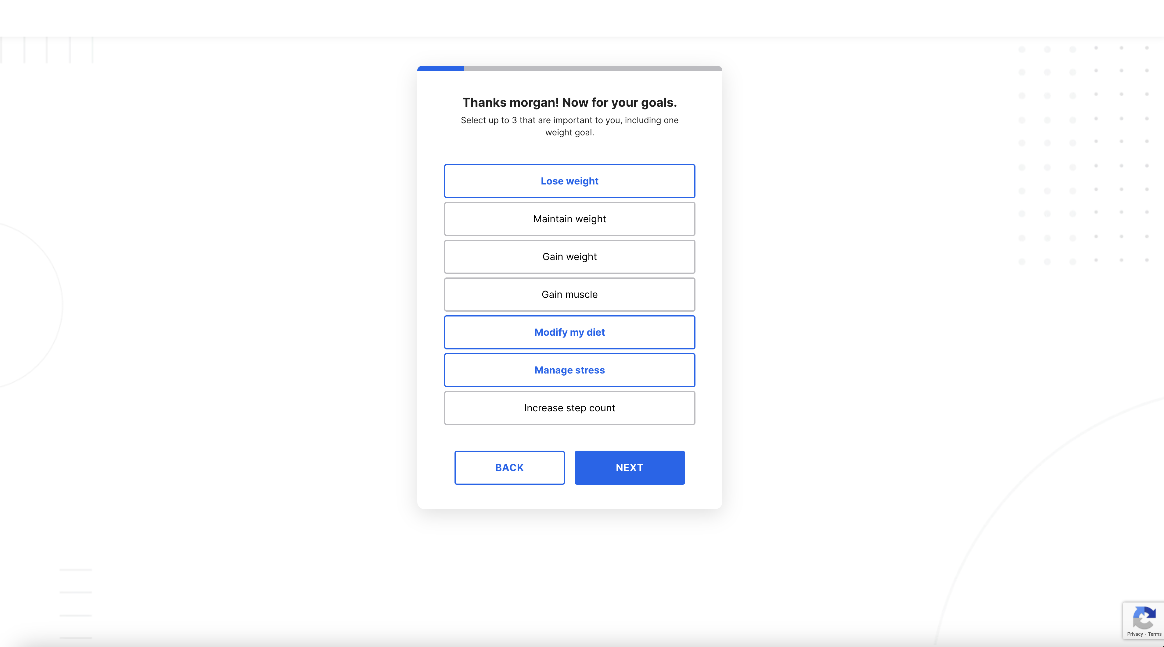
I started by breaking the page apart. One screen, one question. That is not a clever idea. It is the bare minimum a mobile-first product owes its users. The result is a flow that feels less like an intake form and more like a conversation. You answer something. We acknowledge it. We ask the next thing. Nobody is staring down a wall of inputs.
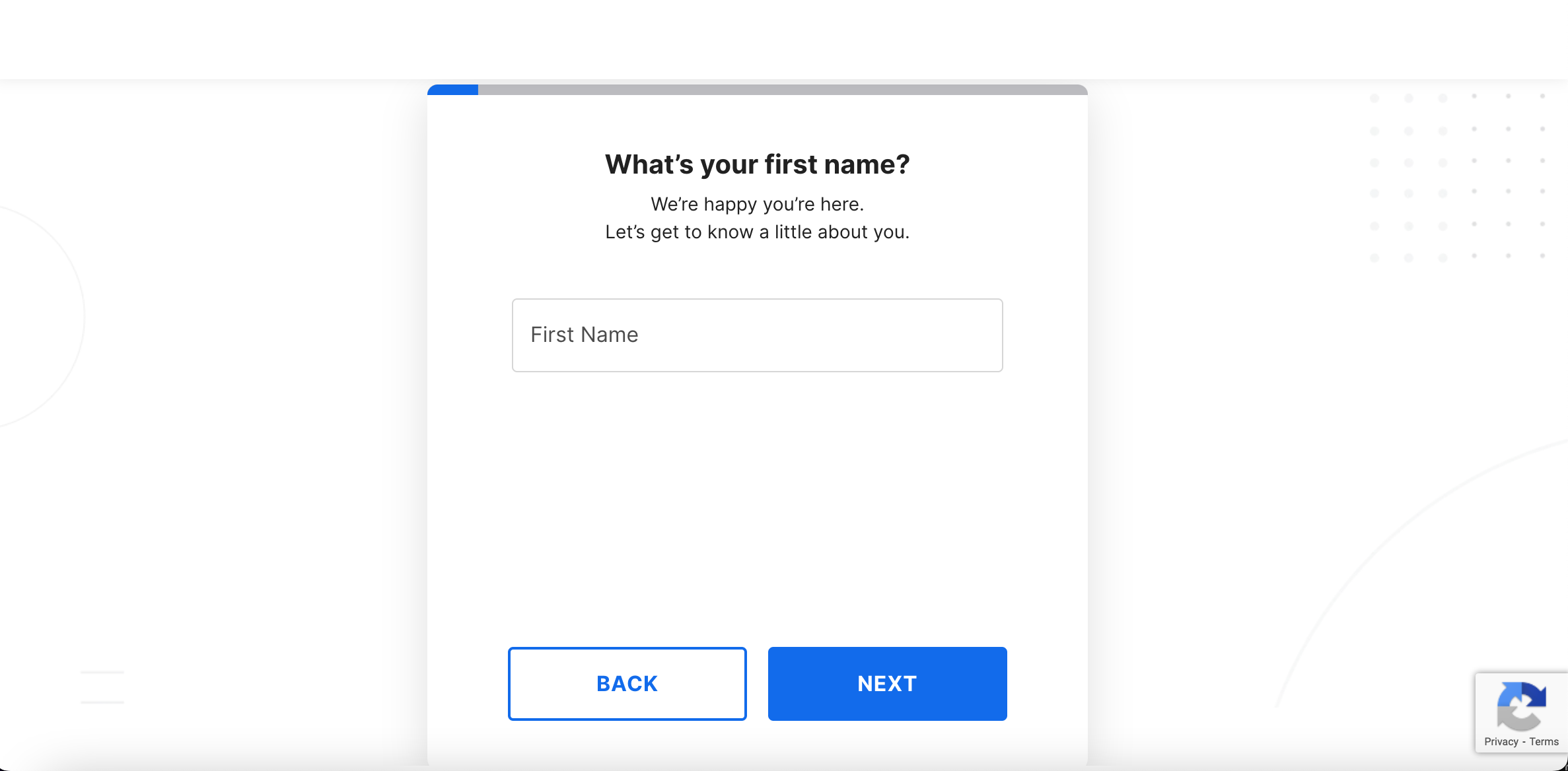
A progress bar sits at the top of every step. I am usually skeptical of progress indicators, because they are easy to make dishonest — the kind that race ahead and then crawl at the end. This one tells the truth. It moves in real proportion to where the user is in the flow. And it does so because users deserve to know how much of their time they are signing up to spend. Telling them is also, conveniently, a small reward each step.
Accessibility was not bolted on at the end. It was the frame around every decision. Real semantic HTML. Real labels associated with their inputs. Focus order that makes sense. Error messages that announce themselves. I worked closely with the design team so that what they handed me in Figma already reflected those constraints, rather than having to retrofit them in code. The cheapest accessibility fix is the one you make before the design ships.
The validations got more attention than I expected. We use Yup, which makes complex validation legible. Some of those validations are mechanical — fields that have to be a number, dates that have to be in the past. Others are judgment calls that the product is allowed to make. A weight goal that is dangerously low is not a goal we are going to silently accept. The app’s mission is health, and the onboarding is the first place that mission shows up. I would rather slow a user down here than let them set a target that hurts them.
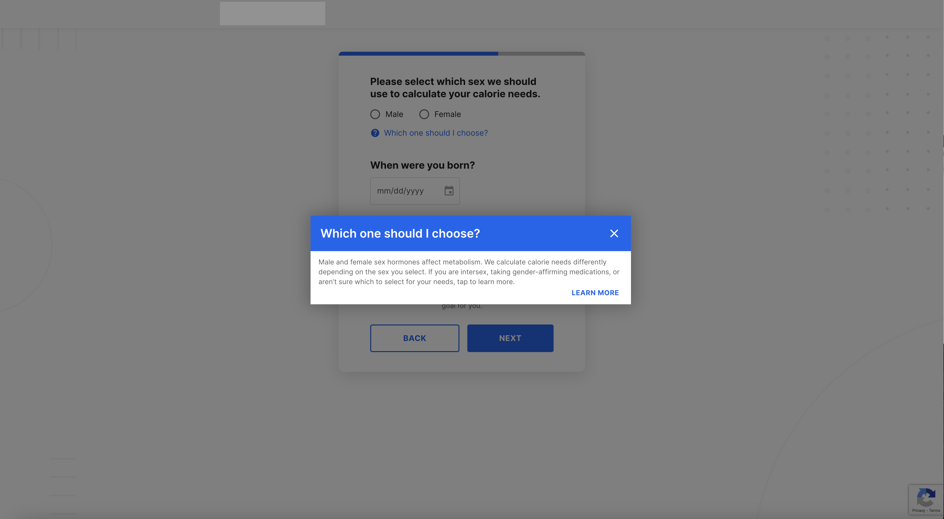
There is a question lurking under all of this that I think a lot of onboarding flows duck. What are you willing to ask, and what do you do with the answer? An onboarding that asks for sex and then renders an inflexible gender model into the database is doing a small violence to a real set of users. Defaults are not neutral. An onboarding form is, in its way, a political document. I am not going to pretend we got every piece of it right. I am going to say that we treated those questions as questions rather than as checkboxes, and that the team kept iterating on them after I left.
What shipped is faster, kinder, and quieter than what came before. That is the kind of work I want to be doing.